School Magazine Front Cover Analysis
I chose the name 'BREAK-TIME' for my magazine because people can read this is their free time, which for the majority of the school is break time and lunch time. It can also connote that this magazine will be for sale at breaktimes. I have used the colours black and yellow as they're the schools traditional colours. I have used a bold black stroke around the yellow writing so that the yellow writing stands out on the white background. I have used the colour yellow as it stands out on the magazine, this could highlight the main purposes and the inner stories of the magazine.
I have used a medium shot image of a year 12 student called Megan, who has recently sat her GCSE's. The image of Megan dominates the front cover, I used a sixth former so that it allows the younger year groups such as year 10/11's who are sitting their GCSE'S to read the article on revision tips and help them while sitting their exams. Before removing the background of this image there was a wall and metal cupboard, I removed the background as I felt that the image would look better without the background. This student is wearing her own clothes which connotes her year group as the sixth formers do not have to wear the traditional school uniform.
The first subsidiary image I have used is of 3 sixth form students. I did this to show what technology students are using to help the readers understand what they can use to help them learn in the future. I used sixth formers because they are role models for the younger years of the school.
I used this image of a class of students because it shows sixth formers hard at work. No matter how free time a sixth former has, they still have to work hard.
This subsidiary image is of a teacher to represent the English department in the school. This teacher is stood in front of an English board which makes it clear that she is part of this department. I used this image to represent the GCSE English grades in 2015.
On the right of my page I have used four sell lines, this indicated the content of the magazine. I used black writing as I think it works well on the white background. I used a different font for the sell lines to make it look more interesting on the page. The writing is also a reasonable size so that it is visible and readable on the page.

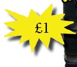
I then put a price for the magazine on the bottom left corner. I did this so the customer knows what price they're paying for the magazine.
I decided to use a splash and a pull quote on my front cover. I used a pull quote to give the reader an idea of what the sixth former has said in the article inside. I also used a splash 'Exclusive' to show that this story will only be found by this person in this school magazine.
Completed Front Cover
This is my completed front page of my magazine it has an organised and clear layout. It isn't too cluttered or messy, and is presented well. My front cover shows information about school life which would appeal to my target audience who are pupils and students in King Henry. I believe that my front cover is recognisable to the school as has students and teachers from the school and it uses the traditional colours.


A good front cover, Megan. You have integrated text and images successfully and your layout is clear and effective. Your colour scheme is attractive and you have used layers appropriately. You could have included text in your footer line.
ReplyDelete